Fort Knox.
A considered digital identity for a drywall and plastering business. Built to communicate the standard of the work through a clear, confident website.
- Industry
- Drywall & plastering
- Plan
- Grow
- Scope
- Brand / Web
- Location
- Nottingham, UK
01 / The brief
Good work.
Clearly presented.
Make the quality of the business feel evident before the first conversation.
Fort Knox already had skilled work and a strong standard of finish. Its website needed to communicate that quality just as clearly.
We developed the brand direction alongside the website, with a simple structure for services, projects and enquiries. The aim was to give prospective customers enough confidence and context to take the next step.
02 / The build
Built around
the work.
Clear services, considered project presentation and contact routes that stay easy to find. Every part has a practical role.
Clear services
The site makes it immediately clear what Fort Knox does, giving each key service enough space to be understood without turning the experience into a wall of trade terminology.
Work that speaks
Project imagery and completed work become part of the sales process, helping potential customers see the level of finish rather than simply being told about it.
Clear next steps
Contact and enquiry actions are kept obvious throughout the site, reducing the distance between seeing the work and starting a conversation.
Built for every screen
The layouts were designed to stay sharp on desktop, tablet and mobile so the business still feels considered when a customer discovers it from their phone.
03 / Creative direction
A quieter kind
of confidence.
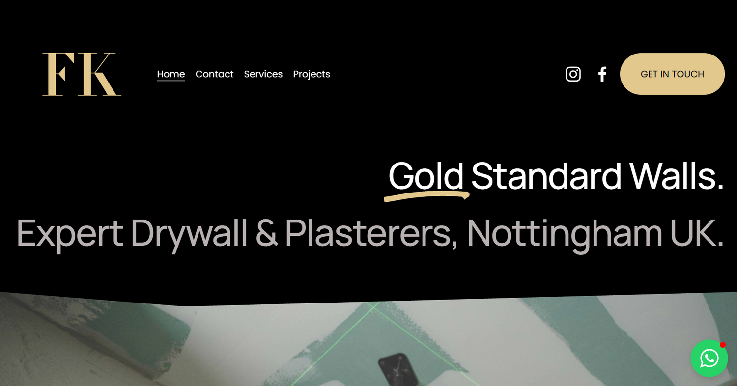
Dark surfaces, restrained gold accents and the FK identity give the business a consistent visual presence. The work stays at the centre.

Gold standard walls.
A recognisable anchor.
The FK mark gives the business a simple visual signature throughout the website.
A restrained contrast.
Gold details sit against dark surfaces, creating emphasis while leaving room for the projects.
Room for the detail.
Large type, generous spacing and a clear hierarchy help customers move from services to project work and then to an enquiry.
04 / The result
The same standard.
A stronger presence.
The Grow plan brought the full business into a clearer digital structure: brand direction, service content, project presentation and enquiry routes.
Fort Knox now has a website that communicates what the company does and gives prospective customers a more considered introduction to the business.